
I've made a few minor class edits based on play tests. I've added a couple of monsters, and changed speeds of characters and monsters to match up with Classic D&D. I made some changes to poisons based on an old post of Alexis' from last November at The Tao of D&D (if you're reading this, it's not exactly your method, but the new system was influenced by yours). Oh, and I've got wandering monster and wilderness encounter tables! It's one thing I completely forgot to add to Flying Swordsmen.
I'm thinking of possibly splitting the book in two. A player's book and a GM's book. Maybe. The draft text is sitting at around 70 pages, but there are some more things I could add (like more monsters and magic items, more examples of organizations that can serve as allegiances for PCs), and a few things I might cut (like the campaign setting, which I could expand and release separately). If I go with the two book approach, they'd both be pretty short though, even if I use ample amounts of art. And I have collected ample amounts of public domain art to use. But I doubt I'll be making any box sets, so I'll probably stick to the single volume approach.
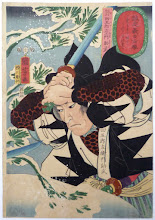
Tonight, I pulled up GIMP and noodled around with a more simplistic (Zen) cover idea, trying to make it look like an old Japanese block print rice paper book. Lee Barber, if you're reading, I could use your graphic design criticism on this!


I can't wait to see this!
ReplyDeleteSummoned like the evil Jinn of graphic design, I am. Block printed visuals are textural, high contrast art. Wholly different from the painted art, yet together on the same page. Unlike Flying Swordsman, which was mostly the one illustration on the cover, here you may need a collage format. I'll re-cut what you posted to demonstrate what I mean, just give me a week or so.
ReplyDeleteCool! Thanks, Lee.
Deletegreat
ReplyDelete2 samples side by side, left is "gonzo movie" style, right is "classic book".
ReplyDeletehttps://drive.google.com/file/d/0B-37SlbK1t1BVjhaN0Y4MzFuZE0/view?usp=sharing
Oo la la, I like both. Gotta think about this a bit. Thanks a million, Lee! Glad you've got my back.
DeleteI'd like to see your method, Dennis. I'm not quite happy with mine.
ReplyDeleteI'll post on it soon. I haven't really gotten to test mine a lot yet. Last session the party Shinobi paralyzed half of the heads of an Orochi with poison, but the Yamabushi's spells and Samurai's blade finished it off before the poison damage kicked in.
Delete