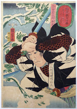
Instead of doing the work I needed to do on my grad school final project (procrastination - I can do it tomorrow...), I was messing around with OpenOffice's version of PowerPoint, with some touchups in GIMP, and mocked up a cover for Flying Swordsmen.
Still needs some work, and I need a version of the picture without the DeviantArt watermark. Waiting to hear from Daxiong about that.
Anyway, opinions wanted. And don't hold back if you don't like it. I can take criticism and it could save me from releasing a game with a crappy cover. :D
Edit: Lee reminded me that I had meant to use the Chinese characters in the cover somewhere. I posted them in the comments, but they're small. Here they are bigger:
翔剣客
The Witches of Appendix N: Margaret St. Clair
17 hours ago


Let me start out by saying this is a surprisingly good start. I’ve seen a lot of covers that were worse actually make it to print.
ReplyDeleteIn particular, I like that the first thing I see is the title and that it is legible even from a distance. The artwork is good too. Multiple characters is a big tickbox for me on RPG covers. And nothing gets in the way of the artwork.
Just my opinions as an informed amateur...
Lose the gradient on the background. Pick slightly more subdued colors for the green of the background and the red of the side borders. If you’re going to do any gradients, they should be much more subtle.
Lose the gradients, 3D effect, and arc on the title. It might feel a bit “flat” then, but better to do what you’re trying to do with those effects with a more dynamic font, if possible.
Three fonts and three sizes of font on the cover is too many. The subtitle and the byline should be in the same font and size.
I’m a big believer in full-bleed art on RPG books. Even with your landscape art on a portrait cover, I’d experiment with full-bleed to the sides.
I'd second what Robert Fisher says, and add that less is more when it comes to cover design.
ReplyDeleteYou have 4 colors next to each other on your cover. If you dropped one of them, it'd be a little less busy.
Also, the bottom text is somewhat hard to read. Keep it all white, and it'll be a little more legible, as black text on green or purple is not easy on us short-sighted folks
I agree with the comments on the fonts above, and would add that as attractive as the artwork is, at first glance, the left hand side appears very empty with all the action to the "right", which leads the eye away from the cover as a whole.
ReplyDeleteI think of medieval Chinese art as having very subdued colours, if not being black and white, so the green background doesn't work for me.
ReplyDeletehttp://thegeekgazette.blogspot.com/2011/02/my-10-favorite-rpg-covers.html
ReplyDeleteHey,
This link has a bunch of different covers of RPGs from the past.
Something I noticed was that most use full cover picture. Or at least the site I found did. The green and red do nothing for me, but really like the right half of that picture.
What about chopping it and making it a full page and then super-imposing your title.
I would almost suggest not putting your name or genre on the front page.
Just a thought.
BTW, when are you releasing this, I am looking forward to taking a look.
-Josh
Like my graphic design profs used to say, too much trapped dead space (from symmetry). Red and green aren't picked up in the art. Scroll edges not effective as texture or for guiding the eye. Warped, gradient fonts belong in a coupon book. If the letter-forms for "flying swordsmen" in Chinese could be provided, I could work them into a logo. Carving a wood version with my sword is extra ;)
ReplyDeleteThanks for the tips, and the offer, Lee.
ReplyDeleteThe Chinese characters are:
翔剣客
Thanks, everyone else, too! I also noticed some of the problems with this when I printed it out last night. I'll give it some more work when I can.
Larger version of Chinese characters edited into post above.
ReplyDeleteFor making artwork, I'd need a link to to the characters in detail, closer to 1" or at least 72 point. A link to the specific illustration would be helpful too. BTW, have you seen the "Weapons of the Gods" RPG done with Tony Wong art? Not D20 but full of hyper wuxia. There was also a product called Ruins & Ronin...but its more OA.
ReplyDeleteLee -- I'll draw them myself and scan them when I get home tonight. My calligraphy technique isn't great (don't have a brush anyway), but I can get a nice big and clean version for you. Thanks!
ReplyDeleteI've heard about WotG, but haven't had a chance to look at it yet. R&R I'm more familiar with but I still haven't downloaded the final project. I was following Mike's development of it on his blog pretty closely, though. Looks like a fun OD&D mod.
There are a couple of similar projects going on now, with Fabian of Blade Sharp working on OA for Labyrinth Lord, and OA for OSRIC being worked on at...escapes me for the moment. I'll get back to you on the other when I'm not busy at work.
Dangerous Brian's doing the OA for OSRIC conversion. Sorry Brian, if you're reading this. Busy with finals, holidays, sick kid, all that stuff.
ReplyDelete