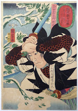
I'm doing the preliminary formatting for Flying Swordsmen, just trying to see how easy it is to piece it all together in a way that looks good, and get an idea of how much art and flavor text to include. I'm shooting for a 128 page book, and it looks like I'll manage that easily with a picture or two or some flavor text on nearly every page, including most monsters.
Still, I'm interested in what you, the potential downloaders and hopefully users of this game would prefer. Since I'm not planning to put out a physical edition yet (hopefully in the future, if it gets enough positive feedback and enough downloads in electronic format, but that's a discussion for another day), how would you like this presented for reading on your computer?
Only five options, and only one vote allowed. I have my draft text in single column portrait, and the current formatting test in double column portrait. But I also like how, frex, Greg Christopher [should I have linked to his G+ account instead? He seems to have given up the blog for G+] does all his games in landscape because they're meant to be read on the computer.
Anyway, the poll will be open for a week. Let me know what you think. Thanks!
The Witches of Appendix N: Margaret St. Clair
20 hours ago


I know I'm a total dinosaur but I still like my books printed on dead trees in an upright format. Can't ever see a day when I lug a computer to the gamestable...
ReplyDeleteDon't ignore the fact that since there is not print version the PDF will often be used to make one by your audience, rather than just reading it onscreen. If you're going for a final digest-sized book, portrait, one-column, please, it makes the text easier to read at small size. If it's meant to be a letter sized or similar book, portrait, two-column for the layout is fine.
ReplyDelete