Here's a version taking into account some of the suggestions my first attempt landed. Looking at it now, I'm thinking the Chinese should actually be above the English in the title. And I'm not sure if the crimson-ish font works or not. Suggestions, please!
Lee B, if you're interested in making a logo and need some more input - like stroke order for writing the characters or whatnot - email me. the_boy_from_illinois [at] yahoo [dot] com


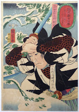
Two minor points I'd make: (a) you're right about the colours not working. (b) The Chinese text should below (in 'headlines' the text on subsequent lines narrows to guide the eye to the story, therefore longest line of text - English - on top), but raised slightly from the picture, there should be some gap between picture and bottom line of text.
ReplyDeleteBut, yes, it looks stunning!
I like the way the art looks in this version, but I actually prefer the look of the title font from the first version better. Loved the way it sorta popped out.
ReplyDeleteLooking better!
ReplyDeleteThis looks awesome.
ReplyDeleteLooks a lot better to me! The text needs to be moved away from the picture more. I’m not 100% sold on the font, but I think it does the job. (And don’t have an alternative suggestion handy.) I’m sure it could be improved further, but it’s reached the limit of my amateur design advice. ^_^
ReplyDeletelooks a lot better
ReplyDelete-josh
A logo that combines ink work and computer layout is going to take some time. I should have a prelim by the end of the week, once holiday embroilment gets under control...
ReplyDeleteThanks, everyone. This is my crash course in graphic design.
ReplyDeleteOn the font -- with the current go-round in the OSR involving font rights, I wanted to use fonts that have free commercial use rights. This is the best 'brush stroke' type font of that sort I could find.
Lee, thanks. It's a hectic time, but I'm not giving myself any firm deadline to get this game released. It's just something I've been working on in my spare time, so if it takes a bit longer to look good, no problem.
Maybe use yellow instead of green for your background? Yellow is the Chinese emperor's color after all.
ReplyDelete