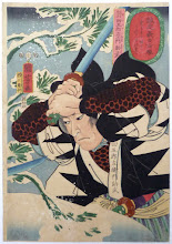
Woke up to find two emails, one from Daxiong, another from Lee, both about Flying Swordsmen.
Daxiong hadn't been on Deviant Art for a long time, so didn't see my message. He finally checked it, and emailed me the picture with no watermark. Which is good, because I'd already wasted a day trying to remove the watermark manually, and was not doing such a good job.
Lee has sent me a couple versions of cover designs he's created. We're still working on them, but he's got some good ideas and the cover is going to look sharp.
What do you think, folks?
Christianity & Cosmology
21 hours ago


Oh my god, they are both fantastic. I can't decide between them - one moment the top one stands out, the next moment it's the bottom one. I think either would look incredible. Sorry I couldn't be of more help ;)
ReplyDeleteLove the top/first one! The title is just... clearer. Less obscured.
ReplyDeleteI'll choose the top one, but so far it's looking fantastic!
ReplyDeleteI like the top title, but I prefer the title below the picture. Also - I need to read that extra bit you sent me and get it back to you - tonight for sure!
ReplyDeleteI like the bottom one best, although they're both fantastic. Well, maybe the top...actually, crap. Can't decide. Although, where's the "OSR Compatible" on the top one?
ReplyDeleteGreat illustration! The cover on the bottom is the one where it is easiest to tell what the work is.
ReplyDeleteI agree with Matt.
ReplyDeleteIf the title were written like the top one, but in the position of the bottom one, then it would rock.
I think I qcho Matt's sentiment about the title, but that is an awesome illustration!
ReplyDeleteThat's "echo" Matt's sentiment...
ReplyDeleteEither way I'm sticking that calligraphy on there...that took a trash can worth of practice brushing :) I can switch the up/down organizations easily. With the art in panorama dimension, it really binds the title graphics into a rectangular alignment. The art is also subdued in hue, which prohibits strong background color.
ReplyDeleteI think #1 is the best. Please let me know when I can throw money at you. :)
ReplyDeleteWANT
Thanks, Reidzilla. Best part for you, it'll be free!
ReplyDeleteI'll likely happily take your money for adventure modules in the future, but the game itself will be gratis.
Sweet! Free is the best price!
ReplyDeleteThese are both excellent covers! I'm leaning towards Matt & Trey's way of thinking though. but to be honest, you can't really go wrong with either of them as they are--this looks wonderful!
ReplyDelete